


Cómo elegir la fuente y el tamaño adecuados para las camisetas deportivas

Las camisetas deportivas son más que simples uniformes; representan la identidad, el espíritu y el profesionalismo del equipo. Elegir la fuente y el tamaño adecuados para las camisetas deportivas es crucial para mejorar la legibilidad, la estética y el atractivo general. Ya sea para equipos profesionales, equipos escolares o ligas locales, la tipografía de una camiseta puede marcar una diferencia significativa en la imagen de marca, el reconocimiento y el rendimiento.
Diversos factores influyen en la selección de la fuente y el tamaño, como la legibilidad, el cumplimiento de las normas de la liga, la durabilidad y el impacto emocional en jugadores y aficionados. Esta guía explora las consideraciones esenciales para seleccionar las mejores fuentes y tamaños para camisetas deportivas, ayudando a equipos e individuos a tomar decisiones informadas.
Comprender los conceptos básicos de la tipografía de Jersey
La tipografía, en el contexto de las camisetas deportivas, se refiere al diseño y la disposición de las letras y números impresos o bordados en el uniforme. Esto incluye el nombre del jugador, el número de la camiseta y, en ocasiones, elementos adicionales como los logotipos de los patrocinadores o los eslóganes del equipo.
La tipografía juega un papel vital para garantizar que las letras y los números sean legibles, visualmente atractivos y estén alineados con la identidad de marca del equipo. La tipografía adecuada puede hacer que un equipo destaque, manteniendo al mismo tiempo el profesionalismo y el cumplimiento de las normas deportivas.
El papel de la tipografía en la marca y la identidad del equipo
La tipografía en las camisetas deportivas contribuye significativamente a la imagen de marca del equipo. La elección de la fuente refleja el carácter del equipo: audaz, agresiva, clásica o moderna. Algunos equipos prefieren fuentes nítidas y vanguardistas para transmitir fuerza, mientras que otros usan fuentes suaves y redondeadas para una sensación contemporánea.
Una tipografía adecuada también garantiza un reconocimiento inmediato. Los aficionados, árbitros y comentaristas deben poder leer los nombres y números de un vistazo. Además, los equipos suelen usar fuentes únicas para crear una identidad distintiva, lo que refuerza la coherencia de la marca en sus productos, presencia digital y otros materiales de marketing.
Factores a considerar al elegir fuentes para camisetas
Legibilidad: garantizar una visibilidad clara desde la distancia
Una de las principales consideraciones al seleccionar una fuente para camisetas deportivas es la legibilidad. Dado que los jugadores están en constante movimiento, sus números y nombres deben ser legibles a distancia. Las fuentes con letras claras y bien definidas y un espaciado equilibrado son ideales. Evite las fuentes demasiado decorativas o cursivas, ya que pueden comprometer la claridad, especialmente en deportes de ritmo rápido como el baloncesto o el fútbol.
Estética: Complementando los logotipos y colores del equipo
La fuente elegida debe estar en consonancia con la imagen corporativa del equipo, incluyendo logotipos y colores. Una estética bien coordinada realza el diseño general y garantiza la coherencia de la identidad visual. Por ejemplo, una fuente sans-serif moderna combina bien con logotipos futuristas, mientras que una fuente serif clásica se adapta a equipos tradicionales.
Durabilidad: Qué tan bien resisten las fuentes en diversos materiales
Las camisetas se someten a frecuentes lavados, estiramientos y exposición a la intemperie. La durabilidad de la fuente depende de la técnica de impresión y del tipo de tela. Las fuentes bordadas duran más en telas gruesas, mientras que las serigrafiadas funcionan bien en materiales transpirables y ligeros.
Cumplimiento: Adherirse a las regulaciones de la liga
Muchas ligas profesionales y amateurs tienen directrices tipográficas específicas en cuanto al estilo, tamaño y ubicación de la fuente. Algunas exigen un estilo de fuente uniforme para todos los equipos, mientras que otras ofrecen flexibilidad. Consulta siempre los requisitos de la liga para asegurar su cumplimiento.
La psicología detrás de la selección de fuentes
Impacto emocional: cómo las diferentes fuentes influyen en la percepción
Las tipografías pueden evocar emociones y moldear la percepción. Las tipografías audaces y angulares transmiten fuerza y agresividad, lo que las hace populares para las camisetas de fútbol y hockey. En cambio, las tipografías suaves y redondeadas crean una impresión amigable y accesible, ideal para equipos juveniles y ligas recreativas.
Percepción: cómo los aficionados y los jugadores ven a un equipo según la elección de la fuente
Los aficionados y jugadores suelen asociar ciertas tipografías con prestigio y legado. Por ejemplo, las fuentes serif clásicas pueden transmitir una sensación de tradición e historia, mientras que las fuentes elegantes y futuristas sugieren innovación y modernidad. Seleccionar la tipografía adecuada puede ayudar a los equipos a establecer una identidad que conecte con su público.
Estilos de fuente populares para camisetas deportivas
Descripción general de las fuentes más utilizadas en los deportes profesionales
Algunas fuentes han ganado popularidad en el deporte profesional gracias a su legibilidad y su diseño distintivo. Entre las fuentes más populares para camisetas deportivas se incluyen:
-
Varsity Block : una fuente clásica conocida por sus bordes cuadrados y atrevidos, que suele usarse en camisetas de fútbol americano y béisbol.
-
Impacto – Reconocido por sus trazos gruesos y espaciado mínimo, lo que lo hace muy legible a distancia.
-
Athletic Script : se utiliza con frecuencia en camisetas de béisbol y sóftbol para transmitir una estética vintage.
-
Helvetica Neue : una fuente sans-serif moderna conocida por su simplicidad y versatilidad.
-
Fuentes de esténcil : se utilizan en camisetas de estilo militar para lograr una estética robusta y resistente.
Guía para seleccionar fuentes de números de camiseta
Diferencias entre las opciones de fuentes para nombres y números
Si bien los nombres de los jugadores requieren una fuente más delgada y legible, los números deben ser más gruesos para una mejor visibilidad. Las fuentes cuadradas con espaciado uniforme funcionan mejor para los números, mientras que las fuentes ligeramente condensadas son preferibles para que los nombres quepan en un espacio limitado.
Consideraciones específicas para la legibilidad de los números en deportes de ritmo rápido
Los números deben ser lo suficientemente grandes como para ser visibles desde todos los ángulos y distancias. Deportes como el baloncesto y el fútbol requieren fuentes muy legibles debido a los movimientos rápidos, mientras que el béisbol permite estilos más decorativos, ya que el juego es más lento.
Personalización y personalización en camisetas deportivas
Diseño de fuentes personalizadas para una identidad única
Muchos equipos y marcas crean tipografías personalizadas para establecer una identidad exclusiva. Una tipografía única puede reforzar la imagen de marca y hacer que la camiseta destaque entre la competencia.
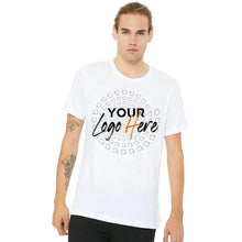
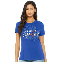
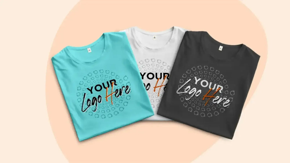
El proceso de personalizar una camiseta con nombres y números
La personalización implica seleccionar el estilo, tamaño y color de la fuente. Los equipos suelen usar vinilo termosellado, bordado o impresión directa sobre prenda para personalizar las camisetas.
Aspectos técnicos de la tipografía en las camisetas
Consideraciones sobre el material: cómo la tela influye en el tamaño y la legibilidad de la fuente
Los diferentes tejidos influyen en la apariencia de una fuente. Los materiales elásticos pueden distorsionar las fuentes más delgadas, mientras que las telas texturizadas pueden ocultar diseños intrincados. Probar la tipografía en muestras reales de material garantiza una legibilidad óptima.
Técnicas de impresión: Serigrafía vs. Impresión digital
-
Serigrafía : ideal para producción en masa, duradera y rentable.
-
Impresión digital : permite diseños intrincados con opciones a todo color, pero puede decolorarse más rápido.
Elegir la fuente y el tamaño adecuados para las camisetas deportivas requiere un equilibrio entre legibilidad, estética, durabilidad y cumplimiento normativo. Ya sea para un equipo profesional, una liga local o un equipo escolar, seleccionar la tipografía adecuada garantiza que las camisetas se vean bien y tengan un buen rendimiento en cualquier deporte. Para quienes buscan opciones de personalización de alta calidad, Custom One Online ofrece una gama de servicios de impresión para dar vida a diseños de camisetas únicos.
Preguntas frecuentes
¿Cuál es la mejor fuente para una camiseta de baloncesto?
Las fuentes en negrita y estilo bloque, como Varsity Block o Impact, funcionan bien para las camisetas de baloncesto debido a su alta legibilidad.
¿Cómo elegir el tamaño de fuente para las camisetas deportivas de los niños?
Las camisetas más pequeñas requieren fuentes proporcionalmente más pequeñas. Una altura de fuente de 5 a 7,5 cm para los nombres y de 10 a 15 cm para los números suele ser ideal para las camisetas infantiles.
¿Existen fuentes que se deberían evitar en las camisetas deportivas?
Evite fuentes excesivamente decorativas, manuscritas o condensadas que reduzcan la legibilidad, como los estilos cursivos o ultrafinos.
¿Pueden los equipos utilizar varias fuentes en sus camisetas?
Si bien los equipos pueden mezclar fuentes para nombres y números, mantener la coherencia en el estilo garantiza una apariencia profesional.
¿Con qué frecuencia cambian las fuentes de sus camisetas los equipos profesionales?
Muchos equipos actualizan sus tipografías cada pocos años para adaptarse a sus iniciativas de renovación de marca o a las tendencias de diseño modernas. Para quienes buscan camisetas personalizadas de alta calidad con tipografía profesional, Custom One Online ofrece soluciones de impresión a medida para garantizar una imagen destacada en el campo.