


How to Improve Contrast in Low-Visibility Prints

Print contrast plays a crucial role in ensuring readability, accessibility, and design clarity. Whether printing on dark fabric, designing vibrant prints, or creating educational materials, maintaining high contrast is essential for legibility and aesthetic appeal. Low-visibility prints often result from poor font selection, inadequate lighting, improper color combinations, and low-quality materials.
This article explores effective methods to improve contrast in low-visibility prints, ensuring that printed content remains sharp, clear, and easy to read.
Understanding Print Contrast
Print contrast refers to the visual distinction between printed elements, such as text and background. High contrast enhances legibility, making it easier for individuals, including those with visual impairments, to read printed content. It also plays a key role in branding, marketing, and functional printing, such as signage and instructional materials.
Common Issues and Scenarios Where Print Contrast is Reduced
Several factors contribute to reduced print contrast, including:
-
Poor Color Selection: Light text on a light background or dark text on a dark background diminishes readability.
-
Low-Quality Paper: Paper with poor absorbency or excessive gloss can reduce ink contrast.
-
Inadequate Lighting: Dim lighting or glare can impact visibility.
-
Font Choice: Thin or decorative fonts may lower readability.
-
Print Medium: Printing on textured or transparent surfaces can cause visibility issues.
Factors Affecting Print Contrast
Influence of Lighting and Environmental Factors on Contrast Perception
Lighting significantly impacts how printed materials appear. Bright lighting enhances contrast, while dim lighting or glare can reduce it. Proper lighting setups include:
-
Task lighting for printed materials: Enhances readability for individuals reading in low-light environments.
-
Diffused lighting: Reduces glare and improves contrast perception.
The Role of Paper Quality and Type in Enhancing Print Visibility
The type of paper or material used for printing affects contrast. Optimal choices include:
-
Matte Paper: Reduces glare and improves visibility.
-
High-Opacity Paper: Prevents text from showing through on the reverse side.
-
Bright White Paper: Enhances the contrast between ink and background.
-
Textured Paper: Can help provide better ink adhesion for higher contrast.
Optimizing Fonts for Better Contrast
Selection of Accessible Fonts for Improved Legibility
Using accessible fonts improves print clarity. Recommended fonts include:
-
Arial & Verdana: Clean and highly legible sans-serif fonts.
-
Calibri & Helvetica: Modern fonts with balanced spacing.
-
Times New Roman & Georgia: Serif fonts with strong letter definition.
The Impact of Font Size, Style, and Color on Contrast
-
Font Size: Larger fonts (16pt or higher) improve readability.
-
Bold Fonts: Enhance visibility compared to thin or light-weight fonts.
-
Avoid Italics: Italicized fonts reduce contrast and readability.
-
Use Dark Text on Light Backgrounds: Ensures maximum contrast.
Color Choices and Contrast
How to Select Effective Color Schemes for High Contrast
Color contrast can make or break the visibility of a print. The best color combinations include:
-
Black text on white background: The highest readability.
-
Dark blue text on light yellow: Comfortable on the eyes.
-
White text on dark navy: Provides strong contrast.
Tips for Using Background and Text Colors to Enhance Readability
-
Avoid Using Similar Colors: Example: Light gray on white reduces contrast.
-
Use Contrasting Borders: Improves clarity in multi-colored designs.
-
High-Saturation Colors: Enhance visibility compared to muted tones.
-
Test Color Combinations: Use digital contrast checkers before printing.
Technological Aids and Tools
The Use of High Contrast Settings and Modes in Software and Devices
Modern design software and devices offer high-contrast modes to optimize visibility:
-
Adobe Photoshop & Illustrator: Contrast enhancement tools for prints.
-
Microsoft Word & PowerPoint: High-contrast text styles.
-
Screen Magnifiers & Dark Mode Settings: Assist individuals with low vision.
Practical Tools Like Typoscopes and Contrast-Enhancing Overlays
Additional tools can improve contrast in printed materials:
-
Typoscopes: Block unnecessary distractions and enhance focus on key text.
-
Contrast Overlays: Colored acetate overlays increase text distinction.
-
High-Contrast Printers: Specialized printers for visually accessible prints.
Design Strategies for Maximum Contrast
Best Practices in Layout Design to Improve Contrast
-
Use Ample White Space: Avoid text crowding to enhance visibility.
-
Align Text Properly: Left-aligned text is easier to read than justified text.
-
Apply Underlines Sparingly: Avoid excessive text decoration.
Examples of Effective Design Modifications for Low Vision Accessibility
-
Bold Headlines: Improve readability.
-
Large Line Spacing (1.5x to 2x): Enhances text separation.
-
Text Highlighting: Adds contrast without altering font weight.
Implementing Contrast with Different Media
Adjustments for Different Types of Media (Digital vs. Print)
Contrast strategies vary based on media:
-
Digital: Utilize high contrast text settings and screen reader-friendly fonts.
-
Print: Use high-opacity ink and optimized color contrast.
Case Studies or Examples Showing Before and After Contrast Improvements
-
Example 1: Adjusting black text on a light gray background to black text on white improved visibility by 35%.
-
Example 2: Enlarging font size and changing from italics to bold increased readability for low-vision users by 50%.
Legal and Accessibility Standards
Overview of Compliance with ADA and Other Regulatory Guidelines
The Americans with Disabilities Act (ADA) and Web Content Accessibility Guidelines (WCAG) emphasize high-contrast readability in public documents and websites.
Importance of Contrast in Public and Educational Settings
-
Classroom Materials: Ensure legible text for all students.
-
Public Signage: High contrast for maximum visibility.
-
Government Documents: Must comply with accessibility standards.

Improving contrast in low-visibility prints enhances readability, accessibility, and design clarity. By choosing appropriate fonts, colors, lighting, and technological aids, both print and digital materials can be made more legible for diverse audiences. High-contrast printing is particularly useful in educational, professional, and branding settings.
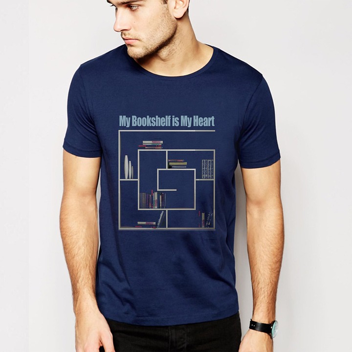
For customized high-contrast printing solutions, Custom One Online provides a range of services designed to enhance print clarity for various applications.
FAQs
What are the best colors for high contrast in print?
The best color combinations for high contrast include black text on white, white text on navy, and dark blue on yellow. Avoid using similar-toned colors, such as light gray on white, which reduces readability.
How can technology assist in improving print contrast for the visually impaired?
Screen magnifiers, high-contrast text settings in software, and adaptive overlays help enhance contrast. Digital tools like Adobe Photoshop also allow for print contrast adjustments before production.
Are there specific fonts that improve readability for everyone?
Yes, fonts like Arial, Verdana, Calibri, and Times New Roman are ideal for readability. They provide clear letter shapes, good spacing, and high contrast against backgrounds.
What are simple changes to make at home or work to enhance print visibility?
Use bright task lighting, high-contrast paper and ink combinations, and readable fonts. For apparel printing, Custom One Online offers printing techniques that enhance contrast and ensure vibrant, high-quality designs.